Curated collection
of design inspiration

Top 5 Graphic Design Trends to Watch in 2025

As 2025 arrives, it brings a wave of innovative graphic design trends that are set to redefine creativity and inspire your next project. Let’s explore the most transformative trends shaping the graphic design landscape this year.

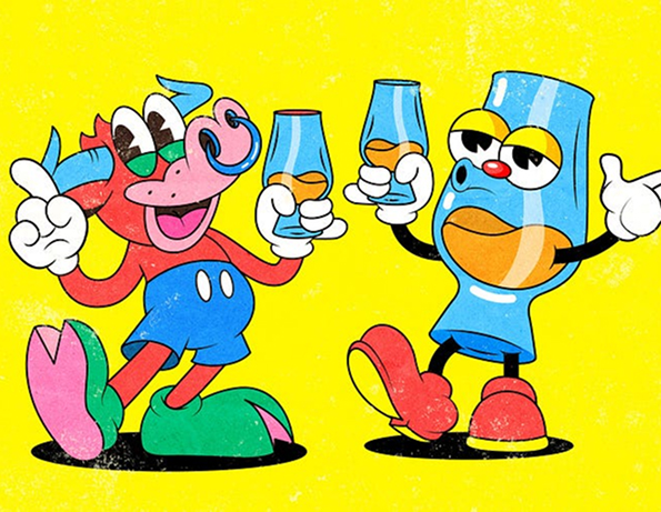
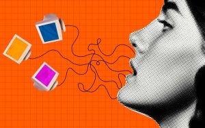
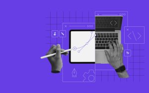
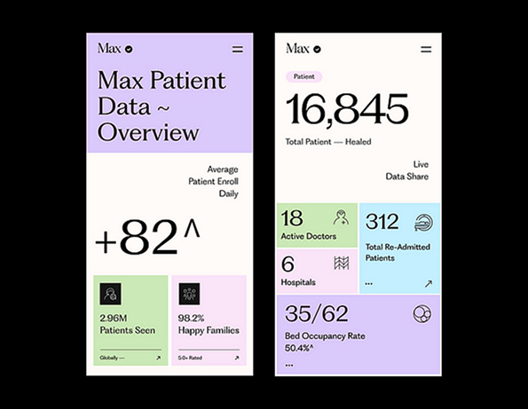
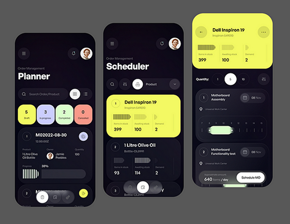
Trend 1: AI-Powered Design

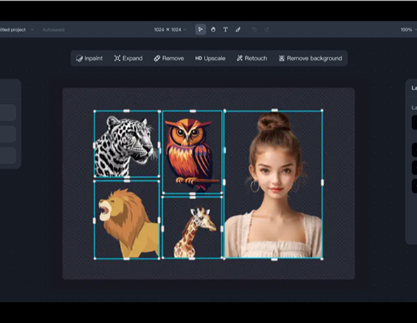
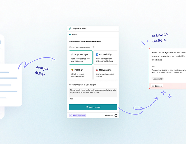
Artificial intelligence continues to revolutionize the design world, offering new ways to craft captivating visuals. From generating lifelike details to producing imaginative compositions, AI expands creative possibilities.

In 2025, AI evolves beyond a mere tool — it becomes a co-creator. Designers leverage AI to rapidly experiment with ideas, fine-tune visuals, and explore a wide range of styles. This technology enhances efficiency while pushing creative boundaries in ways never imagined before.

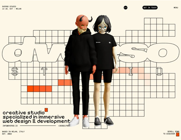
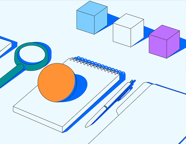
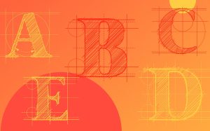
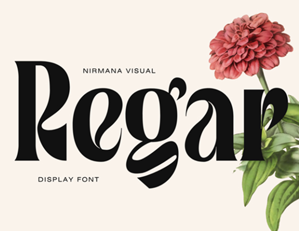
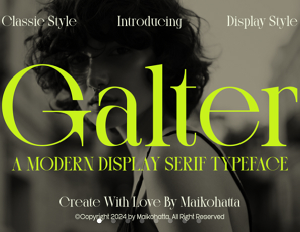
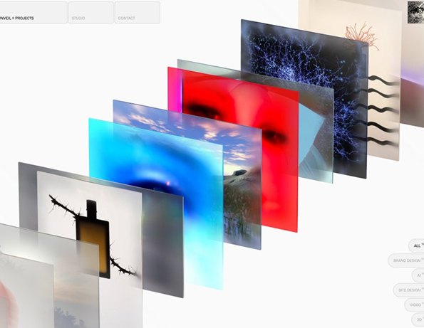
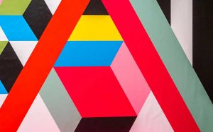
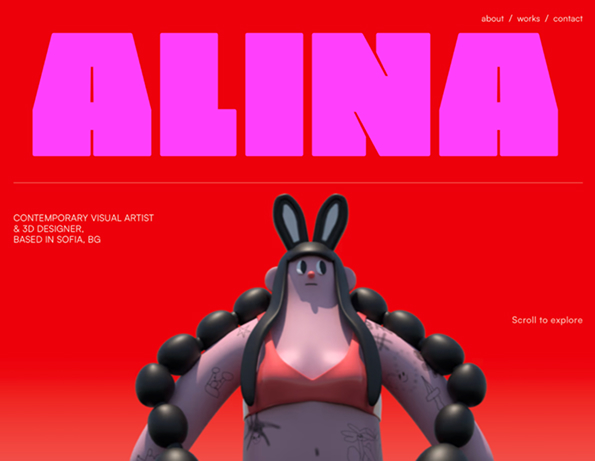
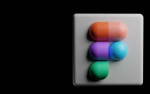
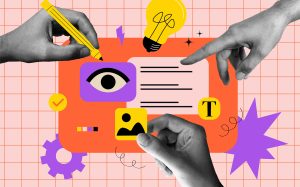
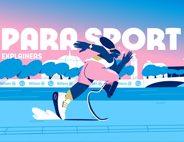
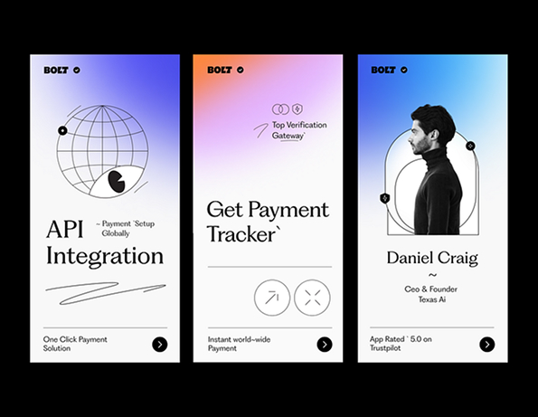
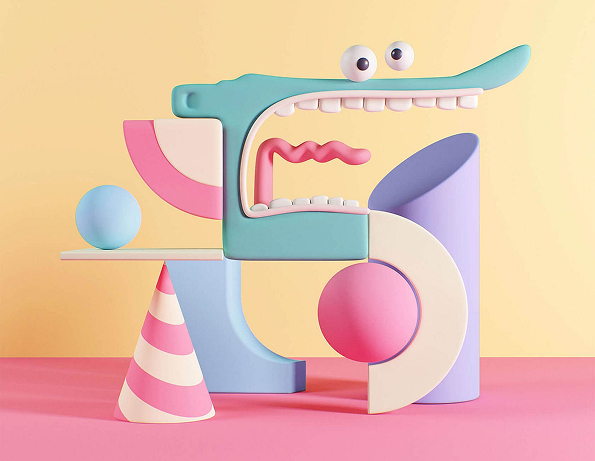
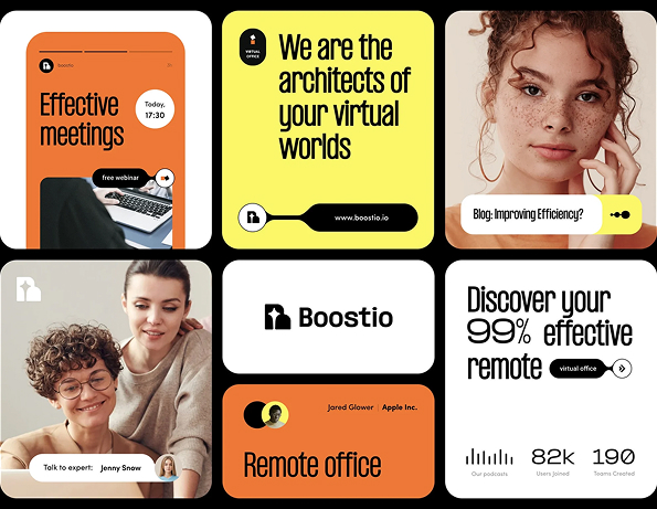
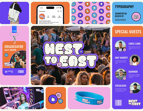
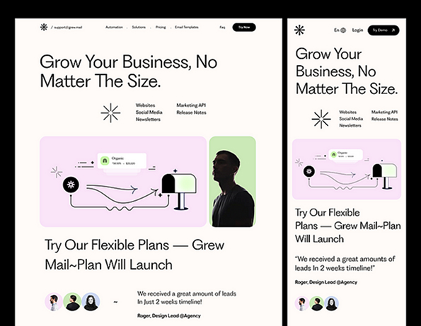
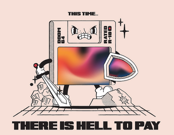
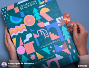
Trend 2: Geometric Abstract Storytelling

Shapes take on a new role in 2025, acting as storytelling elements. Bold lines, circles, and intricate patterns come together to craft visual narratives that resonate with meaning and intrigue. These geometric designs blend simplicity with complexity, offering a modern, distinctive aesthetic. The focus shifts from mere aesthetics to conveying powerful statements through the forms themselves.

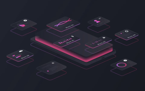
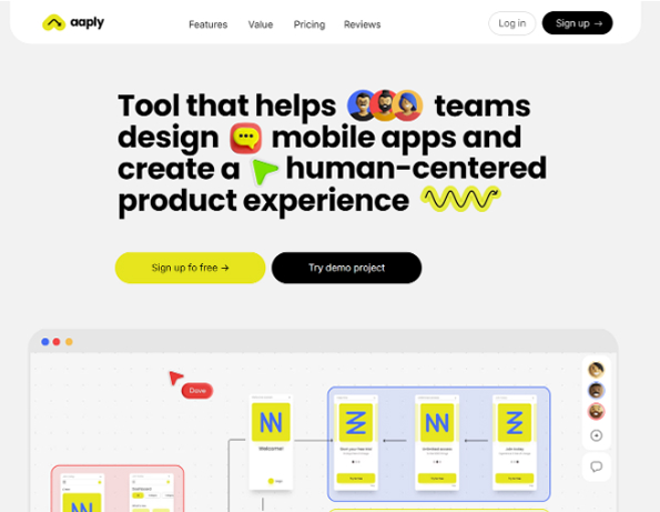
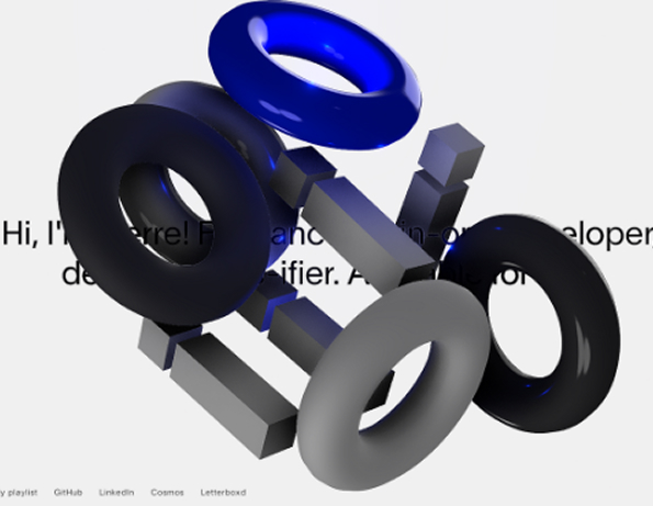
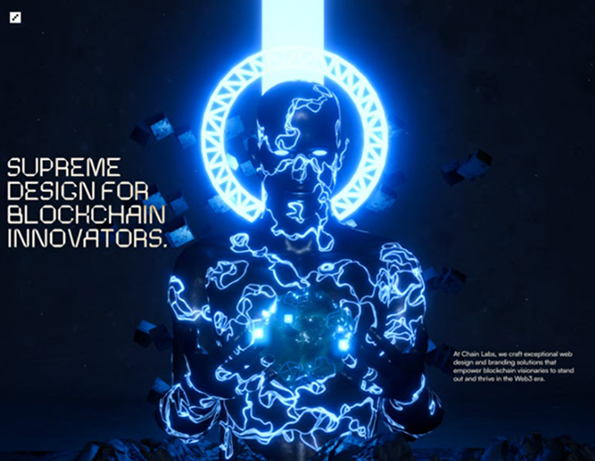
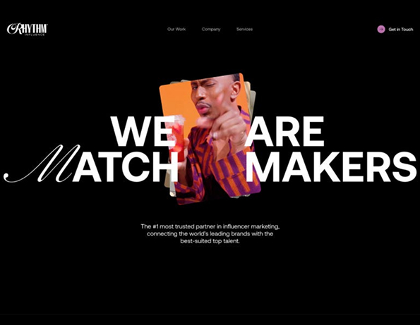
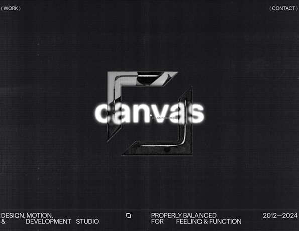
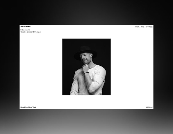
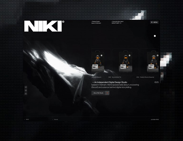
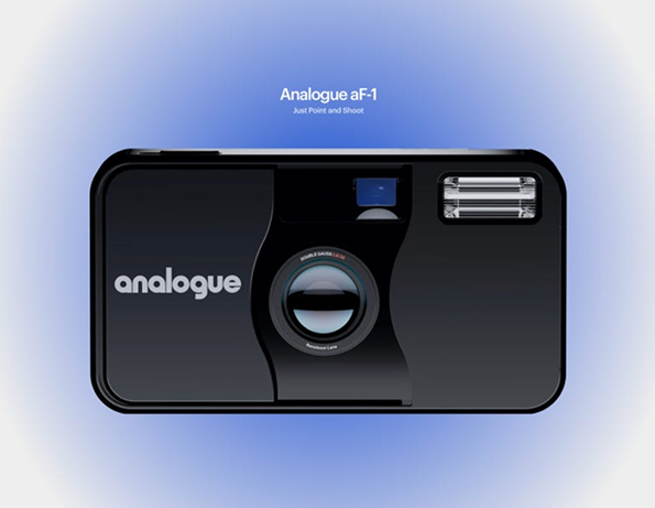
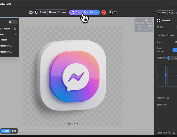
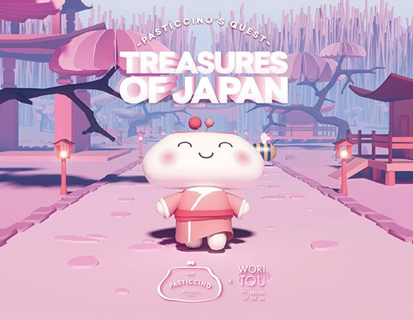
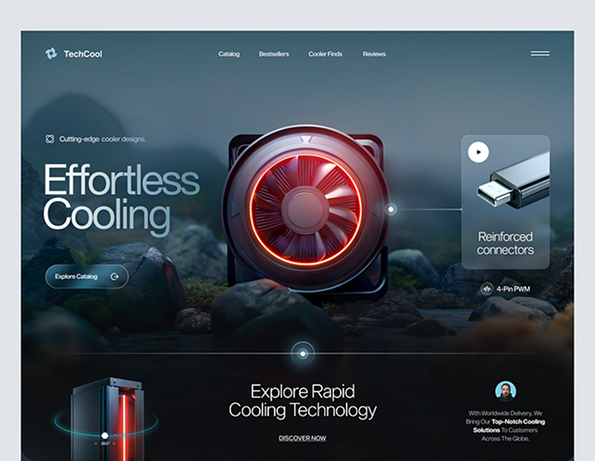
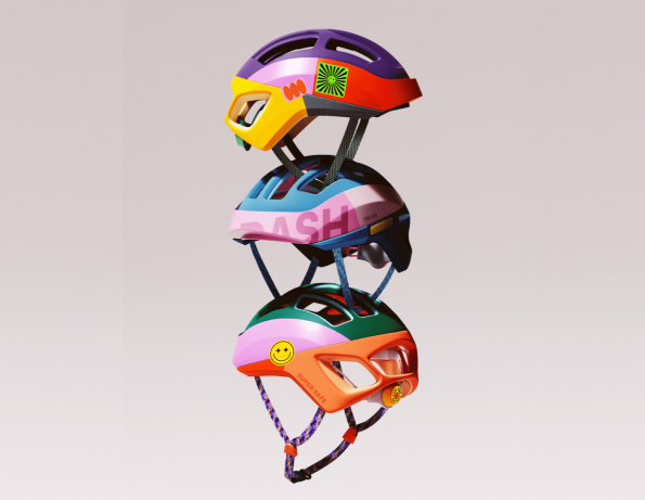
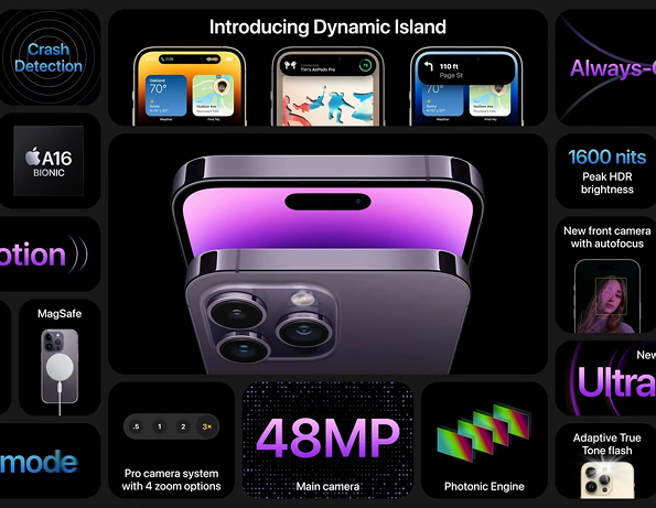
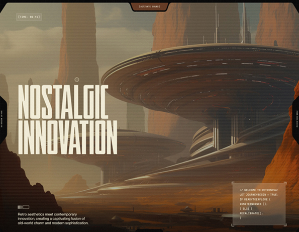
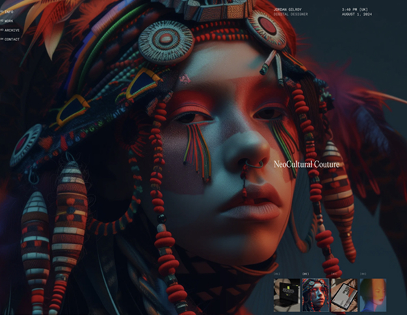
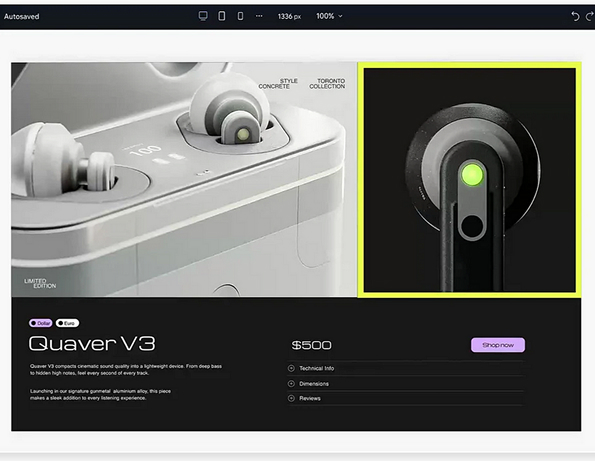
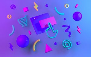
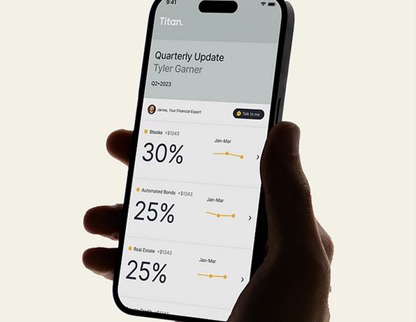
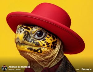
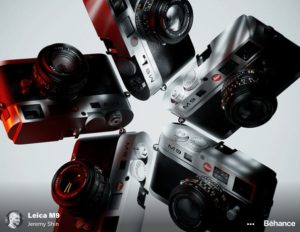
Trend 3: Hyper-Realistic 3D Presentations

In 2025, 3D design achieves unparalleled realism, as companies employ skilled 3D artists to produce highly detailed product renders. These lifelike visuals appear almost tangible, drawing viewers into immersive, interactive experiences.

Designers are pushing the boundaries of digital design with realistic textures and lighting, bringing products to life in unprecedented ways. This trend is revolutionizing product presentations, making them more engaging and realistic than ever.

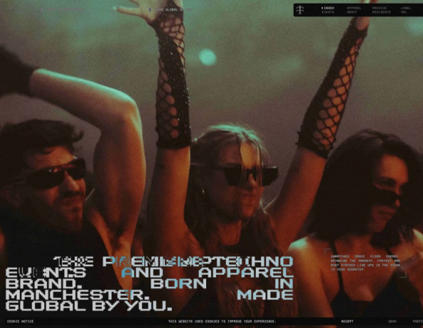
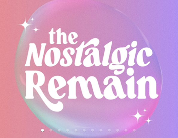
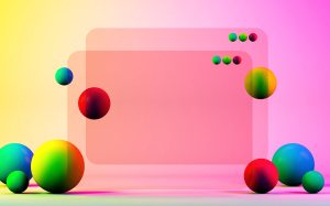
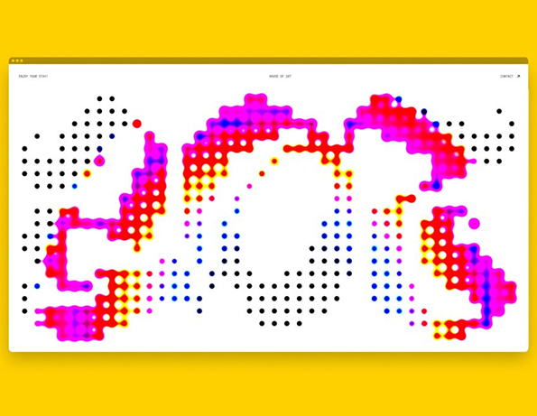
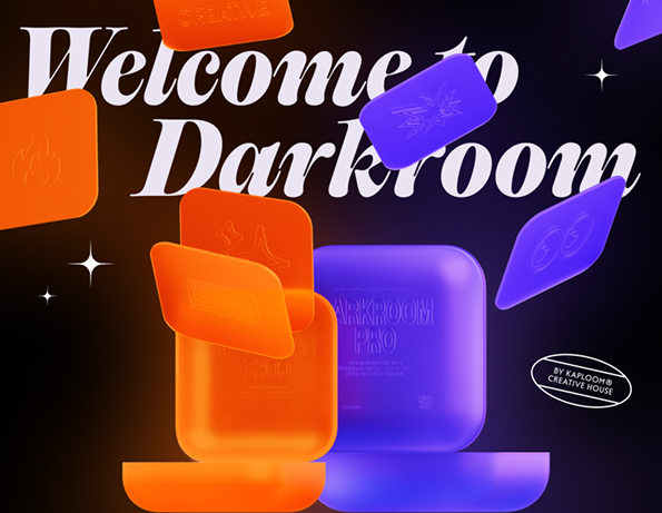
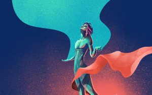
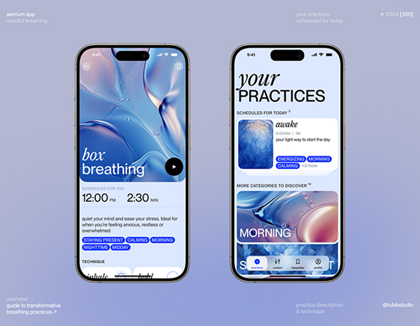
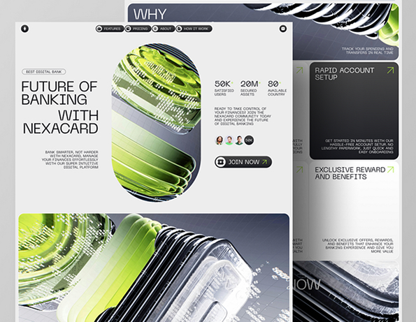
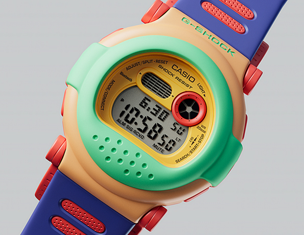
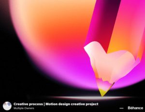
Trend 4: Fluid Dynamic Gradients

Dynamic gradients are making a bold comeback in 2025, infusing designs with motion and vibrancy. Designers are experimenting with gradients in motion, creating designs that feel energetic and alive. These dynamic gradients engage viewers, adding excitement and drawing attention to the designs. The fluid transitions and vibrant effects of this trend offer a fresh, energetic approach to contemporary design, leaving a lasting impression on audiences.

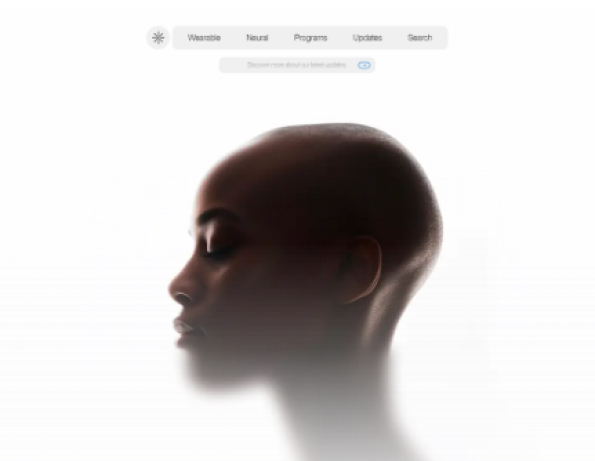
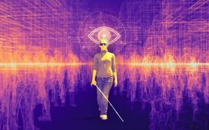
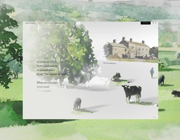
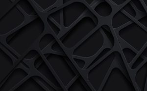
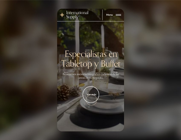
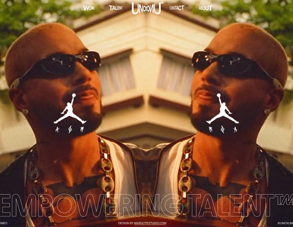
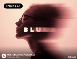
Trend 5: Blur and Distortion Effects

Blur and distortion techniques take center stage in 2025, creating visuals that are intentionally unclear or softened, yet highly compelling. This style embraces the complexities and imperfections of life, blending colors and altering clarity to produce visually unique and emotionally expressive compositions.

By using soft edges and blurred forms, designers evoke a dreamy, artistic atmosphere. This trend provides an opportunity to embrace imperfection and create visually stunning, captivating work that stands out. Whether applied to branding, websites, or artwork, this trend adds depth and intrigue.

With these trends defining the year, designers have an exciting opportunity to push the boundaries of creativity and experiment with new techniques to stay ahead of the curve.

Read post
2025 Top UI Design Trends

Designing for 2025 isn’t just about following the latest trends—it’s about creating experiences that truly matter. As the digital world evolves at an unprecedented pace, UI design must adapt to meet new challenges and seize emerging opportunities.

So, what will define the best designs of this year? Will it be simplicity, bold visuals, immersive experiences, or designs that genuinely connect with users? Let’s explore the top UI design trends shaping 2025.

Bold Typography

Bold typography takes center stage in 2025, with oversized text serving as the primary visual element.

Large, striking fonts become a focal point in designs, grabbing attention and adding personality to the interface. This trend enhances readability while offering a clean, minimalistic layout, making text the standout feature.

Brutalism

Brutalism embraces raw, unpolished design, using bold, large typography and a monochrome color palette to create a striking, unapologetic look.

This design style steers clear of unnecessary decoration, opting for rigid grid-like structures that prioritize clarity and functionality, resulting in a bold, modern aesthetic.

Morphism

Morphism blends sharp clarity with soft, gentle blur transitions, offering a modern, fluid feel to the interface.

The contrast between focus and blur creates a sense of depth, making the design more interactive and engaging. This smooth fluidity enhances the user's experience, resulting in a visually stimulating and intuitive interface.

Emoticons

Emoticon style is becoming a key part of communication in UI design, blending emojis seamlessly with text.

This trend adds a personal, emotional touch to the design, enhancing expressiveness and creating a more engaging user experience. By integrating emojis within text, the design feels more dynamic and relatable, bringing personality into digital interactions.

3D Elements

In 2025, 3D elements go beyond mere decoration to become integral parts of the design. They bring depth, interactivity, and realism, transforming the user experience into something more engaging and immersive.

These dynamic elements not only add visual interest but also guide users through the interface, enhancing their interaction with the content. With their ability to make designs feel more modern and tactile, 3D elements elevate the overall user experience, creating a sense of realism and fluidity.

As we move further into 2025, these trends will shape the future of UI design, offering new ways to enhance user experiences and elevate digital interfaces.

Read post
AI and Accessibility

Did you know that over a billion people worldwide live with some form of disability? Yet, accessibility has often been a secondary consideration in design. Thankfully, things are beginning to shift, with a growing recognition that accessibility benefits everyone, not just those with disabilities.

Artificial intelligence is at the forefront of this transformation, allowing us to go beyond simply meeting accessibility requirements and creating richer, more inclusive experiences. Tools like voice assistants and real-time captions are helping individuals engage with the world in ways that feel more intuitive and seamless.

Let's explore some of the innovations leading the charge toward more accessible designs:

Voice Interaction: A Game Changer for Independence

Voice assistants such as Alexa, Google Assistant, and Siri have transitioned from optional conveniences to essential tools, particularly for individuals with mobility challenges. These technologies empower users to control their environments — from adjusting lighting to setting reminders — all through voice commands.

For designers, this shift requires a fresh approach to navigation. Voice-first interfaces need to be clean, intuitive, and entirely touch-free. Traditional on-screen buttons and menus become secondary, as spoken words guide the user experience. Voice-driven design isn’t just about making tasks easier; it’s about creating independence.

In specialized areas like healthcare, voice-controlled devices are making a profound impact, enabling users to interact with medical equipment or call for assistance, all without physical movement. In education, children with physical disabilities can use voice technology to engage in lessons, fostering equal participation.

Take Voiceitt, for example. This app leverages AI to adapt to unique speech patterns, helping people with speech impairments communicate more effectively with mainstream voice assistants, overcoming traditional barriers.

Making Sound Accessible to All

AI-powered real-time captioning is revolutionizing communication for individuals with hearing impairments. Tools like Google Live Transcribe instantly convert speech into written words, allowing users to follow conversations, meetings, and other audio-based interactions.

These tools are not only enhancing access to everyday communication but are also breaking down language barriers. Multi-language support, for instance, enables people to follow events or work meetings in real-time, no matter the language spoken.

AI is also making captioning more sophisticated by recognizing tone, emotion, and context, which adds depth to the captions, making them more meaningful than just text.

Object and Scene Recognition

AI apps like Seeing AI and Google Lookout are providing people with visual impairments the ability to better understand their surroundings. These tools go beyond object identification, helping users grasp the full context of a scene.

For example, Seeing AI can describe not just the objects in a person’s path but also important contextual information, such as identifying traffic or reading street signs, providing a richer, more immersive navigation experience.

Similarly, Google Lookout is assisting users in retail environments by reading product labels aloud, enabling them to shop independently.

In another innovation, Be My Eyes connects visually impaired users with sighted volunteers and, with AI advancements, now offers even more detailed scene descriptions, such as recognizing emotions on people's faces or capturing the atmosphere of a room.

AI-Driven User-Centered Design: A New Era of Accessibility

Samsung's Good Vibes app illustrates the power of AI in facilitating communication for users who are deaf-blind. The app translates text into Morse code vibrations, allowing users to interact with the world through touch patterns. This is an example of AI enhancing accessibility in an incredibly unique and practical way.

Read post
Inspiration Digest #1

Pantone Color of the Year 2025 exclusively on Wix Studio

Discover Pantone’s 2025 Color of the Year through Wix Studio. Browse a distinctive collection of web design assets featuring PANTONE 17–1230 Mocha Mousse, and bring your next project to life with this on-trend hue.

Chain  -  Labs | Blockchain Web3 Design Studio

Step into the leading hub for blockchain and Web3 design at Chain-Labs. Elevate your blockchain projects with innovative, high-caliber design solutions tailored for today’s digital pioneers.

Experience & Advantages  - David Whyte

Dive into a captivating watercolor introduction that launches David Whyte’s online Companion Portal, setting the stage for an immersive digital experience.

Dverso Studio  -  Web Design & Development

Dverso Studio excels in crafting modern, responsive, and user-friendly websites. Their dedicated team of designers and developers is committed to delivering digital experiences that stand out.

Read post
How to Reuse UX Scenarios

User scenarios are vital for understanding interactions and enhancing usability. Instead of reinventing them for every project, reuse and refine your scenarios to save time while maintaining consistency.

1. Develop a Reusable Template

Create a scenario template that outlines key details—user identity, goals, steps, and outcomes. Enhance it with a checklist to ensure no critical element is missed, and adjust the template for various projects.

2. Build a Centralized Scenario Library

Collect all your scenarios in one easily accessible library. Organize them by tags or categories (like user persona or task type) to quickly locate relevant examples. Sharing this library with your team fosters collaboration and continuous improvement.

3. Regularly Update and Refine

User needs evolve, so review your scenarios periodically using data from user feedback and analytics. Keep a version history to track changes and learn from past iterations.

4. Use Scenarios as a Launchpad

Consider scenarios as starting points for brainstorming new ideas. Invite team input and document insights to address edge cases and atypical user needs, ensuring your designs remain adaptable and user-centered.

5. Leverage Historical Data

Analyze previous projects to identify common trends and pain points. Use these insights to further refine your scenarios, aligning them more closely with real-world user behavior.

By reusing and fine-tuning your UX scenarios, you streamline your design process and focus on enhancing what works—ultimately driving better, more efficient user experiences.

Read post
Inspiration Digest #2

Teletech  - Born in Manchester, Globalized by You

Teletech stands at the forefront of techno events and streetwear. Originating in Manchester and driven by a worldwide community, it delivers electrifying, meticulously curated lineups right to your doorstep.

Rhythm Influence - Influencer Marketing Studio

Rhythm Influence is a talent-first, full-service influencer marketing studio. With unrivaled access to top global influencers, it empowers the voices that shape and define modern culture.

Atomize Design System

Atomize is a cutting-edge UI framework for Figma, empowering designers to build attractive, unified web interfaces with ease.

Untitled UI - The Ultimate Figma UI Kit & Design System

Recognized as the largest Figma resource, Untitled UI lets you launch projects swiftly, conserve valuable time, and enhance your design skills.

Read post
10 Trendy Free Fonts for 2025

Mansfield Font

A versatile geometric sans-serif inspired by iconic 20th-century typefaces like Futura and Avant Garde. Its clean, sharp letterforms and minimal stroke contrast make it perfect for branding and editorial projects.

Neue Power

A modern sans-serif display typeface offered in 6 weights and corresponding obliques. Supporting over 75 Latin-based languages, it caters to a variety of design needs.

Madeleine Stories

An elegant handwriting script that exudes warmth and sophistication. Its flowing, hand-lettered strokes add a personal yet polished touch to any creative project.

Eyes for Serifs

A fresh twist on classic humanistic fonts, this typeface blends familiar elegance with playful details. It’s tailored for editorial and print uses, offering enhanced legibility with a distinctive flair.

Regar Font

A bold display font crafted for strong visual statements. Its clean lines and unique letterforms create a modern vibe, ideal for headlines, posters, and branding projects across both print and digital media.

Nostalgic Remain Font Family

A timeless serif that channels modern chic with a hint of old-world charm. Its refined letterforms bring sophistication and a nostalgic touch to your designs.

Better Minds Font

A fashionable handwritten script designed to mimic natural penmanship. With 15 ligatures included, it delivers an authentic, stylish feel suitable for a variety of creative applications.

LT Serif – Modern Serif Font

A minimalist yet refined serif typeface featuring alternative designs for select capitals. Perfect for magazine headlines, book layouts, banners, and logos, it supports multilingual characters and offers contemporary sophistication.

Galter Font

A modern serif with a balanced interplay between thick and thin strokes, ensuring attractive visuals and readability. Its understated design adds subtle character to any project.

Rightes South Font

A stylish handwritten typeface that merges elegant curves with a modern touch. Its unique strokes lend a premium and sophisticated look, making it ideal for logos, wedding invitations, or any project requiring a personal, artistic flair.

Read post
10 Blog Design Examples

Discover a curated selection of diverse blog designs that fuse creativity with functionality. These standout examples demonstrate everything from bold visual storytelling to innovative, data-driven layouts.

The Swaddle

An editorial platform tackling social issues with bold visuals, The Swaddle uses striking illustrations and vibrant color collages balanced by clean, minimalist typography.

Pirate Wires

With its dark theme and neon accents, Pirate Wires delivers a futuristic, high-contrast design that perfectly complements its edgy, tech-focused content.

Shopify Editions: Summer 2024

This e-commerce update shines with playful, bold color blocks and dynamic imagery. Its modern layout and clean typography make a compelling case for innovation in digital commerce.

Varyer

Embracing a creative and experimental spirit, Varyer features a collage-like layout, whimsical illustrations, and layered typography that invite users to explore without boundaries.

Explore these designs to find inspiration for your own unique blog projects.

Read post
Best Portfolio Websites

A portfolio website is a versatile platform for showcasing work—whether you're a professional, agency, freelancer, or artist. These sites focus on content and creativity, offering endless inspiration for your own projects. Here’s a look at some standout examples:

International Supply

At International Supply, immersive experiences for the horeca sector are front and center. Collaborating with globally recognized brands and featuring an expansive showroom, they create a dynamic environment that highlights innovative design.

Canvas

Canvas is an interactive design and development studio that combines strategy with creative execution. Their work reflects a deep understanding of digital experiences, making their portfolio a rich source of inspiration.

UNVEIL®

UNVEIL® stands out as a technology-driven creative studio. Their portfolio emphasizes forward-thinking design and cutting-edge digital solutions that push traditional boundaries.

House of 207

Founded in 2012 and based in Brooklyn, House of 207 is a design and development studio built by creative enthusiasts. Their projects exude a passion for innovative design and a commitment to engaging, user-friendly digital experiences.

Solvstrom

Led by Danish Creative Director Morten in New York, Solvstrom brings over 15 years of expertise in story-driven design. Their portfolio showcases meticulous design and strategic execution that captivates audiences.

Léo Crouzille

This portfolio features the work of Léo Crouzille, a freelance photographer specializing in construction and architecture. His images merge technical precision with artistic flair, offering a unique perspective on visual storytelling.

Darkroom by Kaploom®

Darkroom, an award-winning design membership from Kaploom® Creative House, exemplifies versatility and quality. With flexible creative services available at any time, their portfolio is a testament to innovation and excellence.

Read post
Inspiration Digest #3

NIKI Studio

An independent digital design studio in Vietnam, NIKI Studio specializes in the art and science of digital storytelling. Their work reflects a commitment to creating immersive and thoughtful digital experiences.

Analogue aF-1

Launching in summer 2025, the Analogue aF-1 is a beautifully designed camera that encourages mindfulness in photography. This tool is designed to inspire users to slow down and capture moments with intention and elegance.

Alina Papazova

Alina Papazova is a talented visual artist and 3D designer, known for her exceptional creativity and innovative approach to digital art.

Merouane Bali

Merouane Bali is a Full Stack Developer who merges technology with creativity. His 3D portfolio showcases his ability to bring together the worlds of coding and artistry seamlessly.

Read post
Inspiration Digest #4

Dreamina

Dreamina is a free AI image generator that allows you to create art and images from text, unlocking limitless creative possibilities.

Jellypod - AI Podcast Studio

Jellypod enables you to create customizable AI-generated podcasts in minutes, making podcast production quicker and more accessible.

Pie Menu — Radial Menu for Mac

Pie Menu enhances your workflow with a customizable radial menu designed for your active Mac app, optimizing navigation and efficiency.

DummyForms

DummyForms is an intuitive drag-and-drop builder for creating professional online forms and surveys without the need for coding, making form creation fast and easy.

Read post
Top 9 Figma Plugins

As a designer, using the right tools is essential to streamline your workflow and boost productivity. Figma, one of the leading design platforms, offers numerous plugins that can help you work smarter and faster. In this article, we’ve rounded up 9 essential Figma plugins that will enhance your design process and make you a more efficient designer in 2025.

1. Vector to 3D

If you’re looking to bring depth to your designs, Vector to 3D is the plugin for you. It converts your 2D text and vector layers into 3D models with just one click. Using a powerful built-in ray tracing renderer, it helps you create stunning 3D icons, banners, and mockups without the need for advanced 3D modeling skills. This plugin is perfect for those who want to add dimension to their designs quickly and easily.

2. AI Design Reviewer

Built by the creators of Siri, AI Design Reviewer is a powerful tool trained on hundreds of guidelines from top sources like Nielsen Norman and IDEO. This plugin provides instant feedback and tailored suggestions to enhance your web designs. It offers critiques on everything from copywriting to UI issues and accessibility, ensuring that your designs adhere to WCAG standards. With this plugin, you can quickly catch and fix UI bugs and improve your design’s overall quality.

3. Cassini Copilot

For teams working on complex projects, Cassini Copilot is a game-changer. It’s a collaborative toolkit that integrates seamlessly into your Figma workspace and browser. Cassini improves the product development process by enabling easy dev feedback with an overlay tool to compare screens with designs. You can also gather visual references from the web and share them with your team, streamlining team reviews with features like comment grouping and due dates for action items.

4. Circular Text

Text manipulation can be tricky, especially when you want it to follow specific shapes. The Circular Text plugin makes this task simple. It allows you to generate circular and arc text in your designs, with options to adjust the angle of the text, such as 90 or 180 degrees. This plugin is especially useful for logo design or any creative typography work that requires text to follow curved paths.

5. Noise & Texture

For designers working on backgrounds, textures, or gradients, Noise & Texture is a must-have plugin. It dynamically creates seamless tiled noise, textures, patterns, and gradients, and allows you to adjust the settings for live updates. You can also customize the canvas size and default colors to fit your project’s needs. Whether you're adding subtle textures or bold patterns, this plugin gives you the flexibility to experiment with different effects quickly.

6. Instance Finder

When working with large files, it’s easy to lose track of where components are used. Instance Finder helps you locate all instances of a component within your file. Simply select an instance or component, and the plugin will generate a comprehensive list of where it’s used across pages and frames. It makes navigation effortless, and clicking on any item will zoom you straight to that specific instance, saving you time and effort.

7. Animate on Path

Animation is an effective way to bring your designs to life. With Animate on Path, you can animate objects along a custom path that you create using the pen tool. This plugin allows you to select an object (such as a frame, instance, or shape) and choose a curve for it to follow. The smooth animations it creates can be used in prototypes, presentations, or even final design files, adding a dynamic element to your work.

8. Design System Organizer

For those working with design systems, Design System Organizer is an invaluable tool. It enables you to bulk swap instances and styles between master components, making it easier to maintain consistency across your design files. You can also copy styles between different files and organize pathnames like “toolbar/nav/back” in a folder-like interface. This plugin helps you keep your design system tidy and well-structured, ensuring that your team can collaborate efficiently.

9. Find and Replace Styles

If you’ve ever needed to update multiple components or instances at once, Find and Replace Styles is the plugin for you. It helps you find and replace styles across your entire file, making it easy to align parameters like auto layout or library styles in bulk. This plugin is ideal for designers who want to ensure their designs are pixel-perfect and consistent across projects, saving time by eliminating the need for manual updates.

Read post
Inspiration Digest #5

UNOXUNO

UNOXUNO is a production and modeling agency that brings together creativity and professionalism to deliver exceptional visual content and experiences. Whether you're looking for top-tier models or innovative production solutions, they specialize in creating impactful, high-quality work.

Pasticcino’s Quest – Treasures of Japan

Embark on an unforgettable journey with Pasticcino-chan as you explore the hidden treasures of Japan, from the historic streets of Kyoto to the vibrant energy of Tokyo. "Pasticcino’s Quest – Treasures of Japan" offers an immersive experience that combines culture, adventure, and breathtaking landscapes.

Alberto Oviedo

Alberto Oviedo is a talented photographer specializing in commercial, portrait, and lifestyle photography. His portfolio showcases his keen eye for capturing moments with precision and style, offering clients a wide range of visual storytelling that resonates with authenticity and creativity.

Paris 2024 Paralympic Games Explained – Kreatives

"Kreatives" offers a comprehensive guide to the Paris 2024 Paralympic Games, providing insights into the history, events, and athletes who will shape this incredible international sporting event. Their expertise prepares the world to celebrate the resilience and achievements of Paralympic athletes in 2024.

Read post
Inspiration Digest #6

Breathing Practices Application

A beautifully designed mobile application by tubik UX for tubik, focused on breathing practices. The design features a clean, user-friendly interface that encourages relaxation and mindfulness, combining both aesthetic appeal and functionality.

Mobile UI

Created by DStudio®, this mobile UI design demonstrates exceptional attention to detail and usability, resulting in a seamless and intuitive user experience.

Website for an Electronics Brand

A sleek and modern website designed by Halo UI/UX for HALO LAB. The design reflects the innovative and cutting-edge nature of the electronics brand, combining striking visuals with an engaging user interface to enhance the brand's online presence.

Nexacard – Digital Bank Card Company Landing Page Website

Designed by Adhiari Subekti for One Week Wonders, this landing page showcases the digital bank card company’s unique offerings. The layout is clean, with a strong focus on conversion through clear calls to action, perfect for a financial product.

Mascot Design

Crafted by OVCHARKA INDUSTRIES, this mascot design captures the essence of the brand with a fun and dynamic character, making it instantly memorable and engaging for audiences.

Koobeast

A unique and bold design by Estilo studio, Koobeast combines artistic creativity and imaginative visual storytelling, creating an impactful brand identity that leaves a lasting impression.

Product Renders

Produced by Peter Tarka, these product renders demonstrate incredible attention to detail and high-level rendering techniques, showcasing products in a way that highlights their features and enhances their appeal.

Read post
Bento UI Grids

Bento UI Grids: A Trend That Endures

Bento Grids have solidified their place as a timeless design trend in the UI/UX world. Originally inspired by the neat, segmented nature of traditional Japanese bento boxes, Bento Grids are known for their ability to provide clear and efficient content organization. Their popularity in web and app design continues to grow, thanks to their clean and functional structure that enhances user navigation.

The beauty of Bento Grids lies in their combination of minimalist design with a strong visual hierarchy, offering an intuitive and aesthetic experience for users. These grids allow for easy scanning of content, making them especially useful for websites and applications where clarity and user experience are paramount.

Here are some remarkable examples of Bento Grids in action that demonstrate their versatility and effectiveness:

Bento Grids by @cactusui

These grids feature clean layouts, ensuring that content is neatly organized while maintaining a sense of simplicity and ease of use.

The RDBP Branding by Gal Shir

Gal Shir brings a dynamic approach to Bento Grids, incorporating thoughtful design and engaging visuals to create a memorable user experience.

Bento Grid by @kacperfyi

This Bento Grid example showcases sharp alignment and precise use of space, providing both functionality and an elegant visual composition.

Bento by Linearity

A standout in the design world, Linearity’s Bento Grid is known for its modern touch, using strategic placement and alignment to highlight important elements while keeping things visually appealing.

Boostio Branding, Brand Identity Design by Halo Branding for HALO LAB

This project leverages the Bento Grid to effectively communicate the brand’s identity through clean, structured content that engages the audience and highlights key features.

Apple Event September 2022: iPhone 14 Pro

Apple's website uses a Bento Grid approach to showcase the iPhone 14 Pro, with each section laid out for ease of exploration, making the navigation smooth while highlighting key product features.

Bento Grid Usage for WhatsApp Case Study

WhatsApp’s interface utilizes Bento Grids to neatly present various sections of the app, helping users navigate through conversations, settings, and media with ease.

W2E Conference Visual Identity by Halo Branding

The Bento Grid is also used in the conference’s visual identity, ensuring that information is presented in an organized, digestible manner for attendees.

These examples prove that Bento Grids are more than just a trend; they’re an effective, enduring solution for creating user-friendly, aesthetically pleasing designs.

Read post
Inspiration Digest #7

Retronova | Timeless Fashion

Retronova effortlessly combines retrofuturism with the allure of a future that never was. This platform features a unique fusion of nostalgic fashion, animations, and retrofuturistic elements, creating an immersive experience that transports visitors to a stylish, imaginative world of the past’s vision of the future.

Friend AI

This week, the buzz is all about Friend AI — a futuristic gadget that could easily belong in a ‘Black Mirror’ episode. As unconventional and bizarre as it may seem, Friend AI is creating waves due to its potential to transform how we interact with technology, offering a glimpse into a world where AI becomes deeply integrated into our personal lives.

Bid(S) For Survival

Bid(S) For Survival is an exhibition that delves into the concept of human longevity through art and speculative fiction. The website’s design provides an immersive journey, guiding visitors through thought-provoking scenarios that tackle life extension and the many ethical, social, and cultural questions that arise when considering the possibility of overcoming biological aging.

Jordan Gilroy

Jordan Gilroy’s portfolio is a visually striking collection of digital art and graphic design, characterized by a sleek, minimalist layout that perfectly showcases his talents. The clean design highlights his expertise in digital media, presenting his work in a way that’s both engaging and easy to navigate.

Read post
7 Tips for Small Business Websites

At Uiino, we often dive into the intricate aspects of website design, focusing on research, wireframing, content strategy, testing, and more. However, when it comes to designing websites for small businesses, the scope changes drastically due to budget and time constraints. In these cases, the goal is simple: create a website that informs customers about the business's services or products.

Today, we're going to focus on making the website design process for small businesses as efficient as possible. Even if it means cutting a few corners, the final result can still be impressive.

1. Mindset: Creating a Perfect Website is Harder Than You Think

First, manage your expectations. Building a high-quality website requires experience, and while it may seem simple to an untrained eye, it's a complex task that involves design, development, and copywriting. If you don't have an experienced team or a big budget, focus on getting a solid, “good enough” website for your business.

2. Start with Content, Not Design

After setting the right mindset, start by focusing on your website's content. One common mistake small business owners make is prioritizing design first and filling it with content later. Your website should reflect what you want to communicate and showcase, with content dictating the design, not the other way around.

3. Use Modern Website Builders

Website builders like Wix and Squarespace have come a long way in recent years. They offer professional-looking websites at a fraction of the cost of hiring a designer. These platforms handle everything, from design to domains and hosting, making them ideal for small businesses on a budget.

4. Choose a Template That Fits Your Business

All popular website builders offer templates designed for various types of businesses. Whether you're running a car repair shop, a bakery, or a barbershop, you're likely to find a template tailored to your industry. Choose a template that aligns closely with your business to minimize the need for extensive changes.

5. Focus on Essential Pages First

When working with limited resources, prioritize essential pages like Home, About, Contact, and Services or Products. Additional pages can always be added later. Keep the design simple and functional, reducing the time spent on intricate visual elements.

6. Use Stock Resources for Visuals

While real photos of your business can be valuable, you can often do without them. Websites like Adobe Stock, Shutterstock, Unsplash, and Pexels offer high-quality images, icons, and other visual elements that you can easily integrate into your site. Stock resources are a quick and cost-effective way to add professional visuals.

7. Outsource to Focus on Your Business

If you're tech-savvy, creating a website yourself might not be a challenge. However, if you're not comfortable with web design, consider outsourcing the task to professionals so you can focus on growing your business. Many website builders have drag-and-drop editors, but certain skills and a sense of aesthetics are still necessary.

Is It Hard to Create a Website for a Small Business?

While large, complex websites are necessary for big companies, small businesses often don't need elaborate websites. If your website is just a place to showcase your work and provide contact information, you can create a functional website in a day or two. With the right mindset and approach, it can be a smooth and effortless process.

By following these tips, you'll save time and create a functional website that meets your needs. Remember: focus on the essentials first, and refine your website over time. This approach will give you a solid MVP (minimum viable product) to start with, and soon enough, you’ll have a website to brag about! Best of luck!

Read post
Inspiration Digest #8

Mobile UI by DStudio®


Salesforce CRM AI Workbench Scheduler SaaS by Jack R.

Web UI by DStudio®

Titan Rebrand by Robbin Cenijn

Casio G-Shock Evolution by Konstantin Datz

Doom Floppy by Razvan Vezeteu

Dubai Design District by Sebastian Curi

Read post
10 Web Design Mistakes
Designing a visually appealing and functional website can be tough. Here are 10 common mistakes and how to avoid them for a better user experience and improved site performance.

Ignoring Mobile Responsiveness

Mistake: Focusing only on desktop versions and neglecting mobile users.
Solution: Implement responsive design techniques using CSS media queries to ensure a seamless experience across all devices.

Overloading with Content

Mistake: Crowding pages with too much text and imagery, overwhelming users.
Solution: Keep it clean and simple, using whitespace to let content breathe and focusing on concise, impactful messaging.

Poor Navigation

Mistake: Complicated or unclear navigation that frustrates users.
Solution: Design intuitive navigation with clear labels and a logical structure, adding a search bar for ease.

Slow Load Times

Mistake: A slow website that drives users away.
Solution: Optimize images, use efficient coding, and leverage caching to speed up load times. Tools like Google PageSpeed Insights can help.

Ignoring SEO Principles

Mistake: Neglecting SEO, making your site hard to find.
Solution: Use SEO basics like descriptive titles, meta descriptions, alt text, and keyword-rich content to boost search engine visibility.

Inconsistent Design Elements

Mistake: Using inconsistent fonts, colors, or styles that disrupt the user experience.
Solution: Establish a style guide and maintain consistency throughout your design to create a professional and cohesive look.

Lack of Accessibility

Mistake: Failing to accommodate users with disabilities.
Solution: Follow Web Content Accessibility Guidelines (WCAG), using alt text, keyboard navigation, and clear fonts for a more inclusive site.

Not Testing Across Browsers

Mistake: Designing for just one browser, causing compatibility issues on others.
Solution: Test your site on multiple browsers to ensure it works seamlessly everywhere, using tools like BrowserStack.

Overuse of Animations

Mistake: Excessive animations that distract users and slow down the site.
Solution: Use animations sparingly and only when they enhance functionality, avoiding heavy ones that hinder performance.

Ignoring User Feedback

Mistake: Not gathering feedback and missing out on insights to improve your design.
Solution: Collect and analyze user feedback through surveys, usability testing, and analytics to refine your website.

By avoiding these common mistakes, you can create a more efficient, user-friendly website that performs better and engages visitors.
Read post